We bid goodbye to boring, standard websites in 2018 as we begin to usher in the artistic flair of designers which has otherwise been kept at bay. Now is an optimal time for a website refresh, adding in trendy (or against-the-trendy) design elements. If you want to read about the newest web design trends in 2019 read our other blog.
Web Design Trends 2018:
Maximalism Greets the World
Until now, minimalism has pervaded the trends of most industries – fashion, apparel, architecture, lifestyle and certainly, art and design. Websites quickly embraced the ‘less is more’ motto, keeping pages tidy, organized and far out of reach from clutter. But now, some of the most impressive designs are bold and daring, projecting busy and loud displays that designers call maximalism. Consumers have already gotten used to and bored with the typical clean website. Now, they like a bit of a hunt on a homepage for the enter button or the requirement to play the game or win a strategy in order to unlock the site. Maximalism might not stick around for too long, but in 2018, it is a fun concept to play with and with which to attract consumers.
Content Hubs are Popular
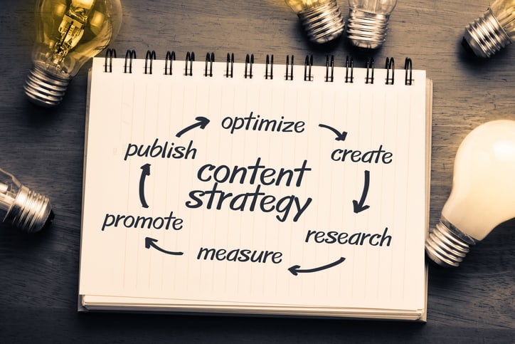
Content matters! It does! Google has been a progressive push for quality content on websites, as reflected by their algorithmic changes to favor well-produced, well-researched, well-written and relevant content. SEO has almost required content to be uploaded often. Now, consumers rely on websites for meaty, thought-provoking, insightful and news-related content on their websites. If you do not already treat your website as a content hub (on or off the blog), this is your year to do it.
Illustrations Replace Photographs
Gone are the confinements and limitations of photography, overcome by the power of illustration. At the beginning of the advertising boom in the 1950s and 60s, illustrations were popular by default, but now, the simplistic design form is making a cutback. Illustrations offer a fun and alternative design option, but they also help marketers out by keeping the consumer profile out of the photo. An illustration of a consumer can easily mask qualities such as race and gender.
Drifting away from the Straight and Narrow
Perfectly straight horizontal and vertical lines are no longer of interest to consumers. Web designers have almost unanimously begun to forego any straight-lined or sharp-edged design elements in favor of robust or oblique shapes. Rounding out edges, over-laying shapes and infuses pages with multiple colors has worked its way up on the trends and seem at least to be here to stay for the year.
Pervasive Elements
When advertisers first started using pop-up windows to grab users’ attention, the reaction sat somewhere between light annoyance and rage. But as consumers got used to a brand popping up on their window with special offers or email opt-ins, they quit actively searching for these inputs on a website. Now, it’s up to designers to constantly deliver information and content through pervasive elements without disrupting a user’s enjoyment of their website navigation.
Brutalism Becomes Mainstream
Doing exactly what an artist shouldn’t is often exactly what makes an artist appeal to an audience. Brutalism describes a design style that is jarring or even offensive. Think of brutalism as shock value design that maintains its artistic integrity, which should be easy as we’ve watched an infiltration of shock value in media and marketing in 2017-18. That said, be mindful of how you create and deliver your brutalism design elements; tastefulness and tactfulness are key.
Serif Returns
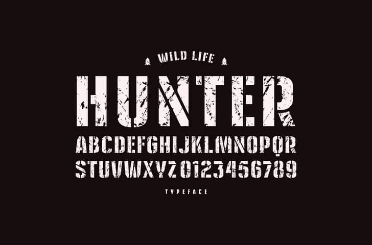
 We are amidst exciting font times in 2018. The golden standard in web design has long favored sans serif headline text (the letters without any tails) and serif long-form text, regardless of brand identity. Alas, serif makes its prominent debut on many websites and shows that it is here to accurately reflect all thoughtful, serious and refined brands on the web.
Spiced-up Page Transitions
How did we not never before utilize the transition time from page to page on a website? Imagine how commonly you find yourself browsing online, moving laterally from tab to tab, sometimes scrolling vertically down to new content windows. In 2018, designers have amped up transitions, keeping consumers excited and engaged as they move from one page or piece of content to the next.
Mainstays Float instead of Staying Fixed
Traditionally, mainstays sit at the top of a website page. Now, many mainstays are floating, moving with consumers’ browsing actions. If a user scrolls down, the mainstay follows. At first, the floating mainstay feels out of sorts, but users are quickly adapting to the new design tendency.
Engaging Long-form Content
Written content is important and definitely prevalent on websites, but it’s growing more important than ever to include engagement features such as pop-up text, images or infographics to keep consumers following along and thoroughly engaged to the end of a piece. Engaging long-form content is necessary for blogs, but it’s also useful across all web pages, from the homepage to about us, from recipes to product instructions.
Surprising Scrolling Reactions
Scrolling effects are new elements we’re seeing in 2018. Basically, when a user scrolls up or down on a page, something other than a same-pace page movement occurs. This might be a different speed scroll, an image pop-up or another artist design surprise.
Overlapping or Blurred Gridlines
Gridlines no longer demand rigidity. Instead, they open up their parameters to text and images floating beyond gridlines or into the next gridded area of a web page. In the past, a 1:1:1 or 2:1 grid layout has offered users an easy way to digest the information before them. Now that consumers are used to the standard website flow, they are up for a surprise design, be it as small as lines blurring between an otherwise rigid and linear grid system.
Website design is getting exciting. If you do not have a team of artists working on an innovative online presence for your brand, reaching out to Executive Digital and learn more about what we can do for your website.

